
PFF gets roasted for Atlanta Falcons QB tweet
"Is this a real tweet?"

Joel Embiid has been treated for Bell’s palsy
The treatment has reportedly been happening since the Play-In Tournament.
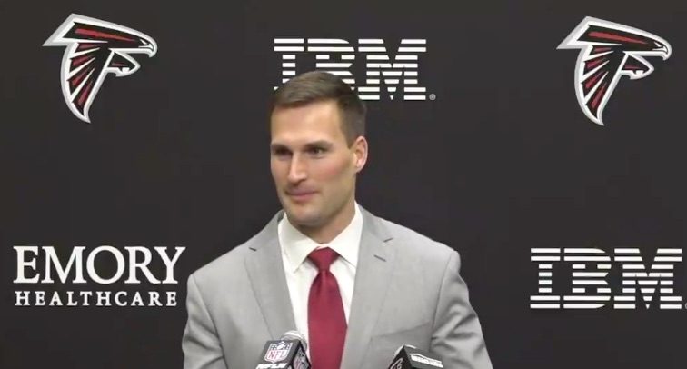
Kirk Cousins reportedly ‘stunned’ by Falcons first round pick
Cousins signed with Atlanta in March.

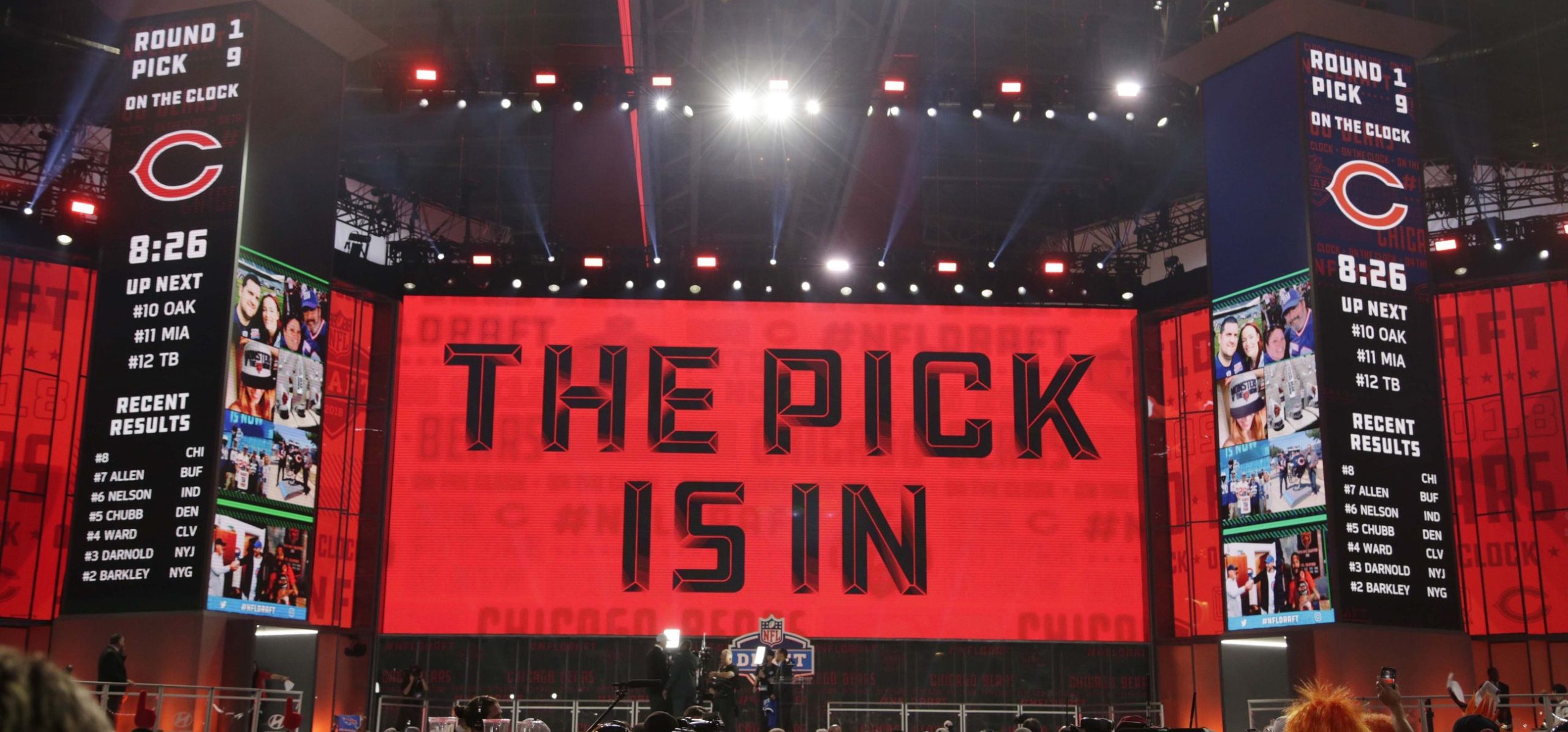
NFL world reacts to ‘insane’ absence of defensive players early in draft
"Absolutely insane."
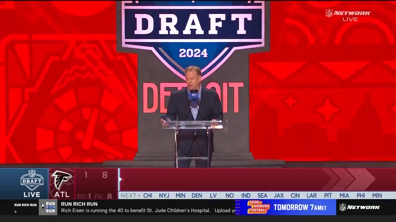
NFL world shocked by Falcons first round pick
What a stunning pick.
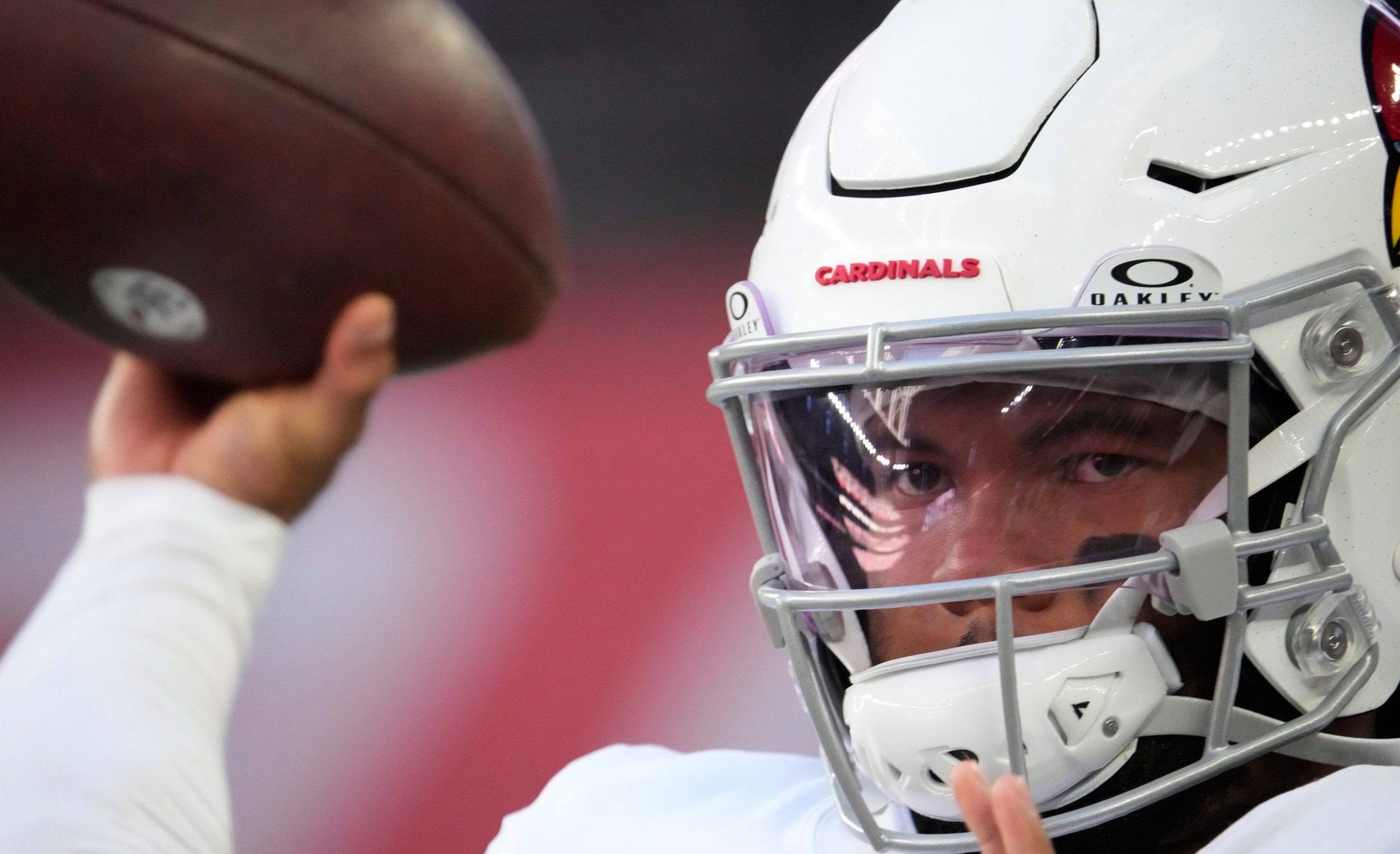
Kyler Murray reacts to Cardinals drafting Marvin Harrison Jr.
Star quarterback Kyler Murray appears to be a fan of his new WR.
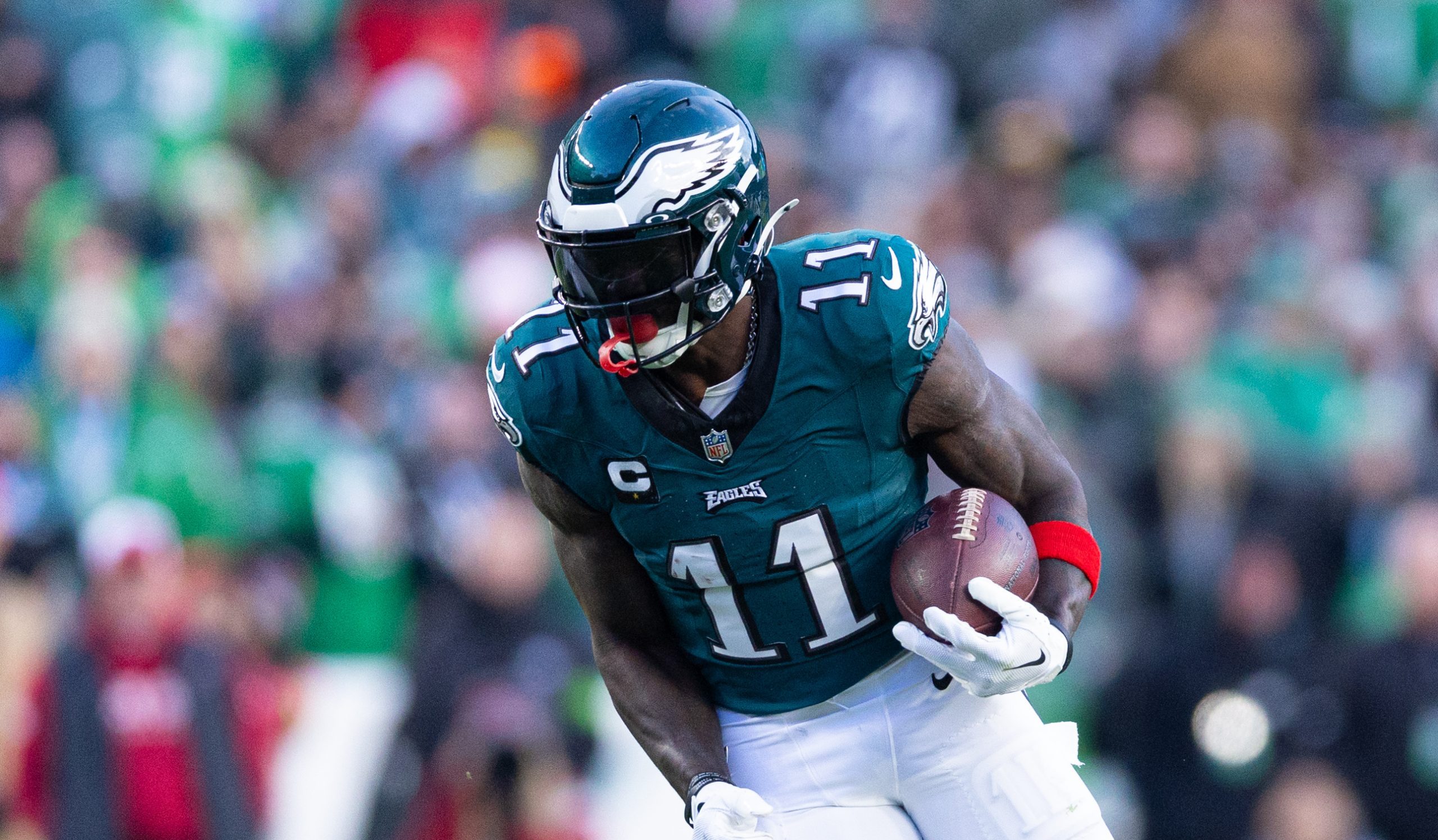
NFL world reacts to star player’s eye-popping extension
The Eagles agreed on a contract extension for star wide receiver A.J. Brown on Thursday.

Jeff Pearlman names nicest MLB player
"The most amazing thing is he invited the beat writers of the Reds to his wedding. That doesn't happen."

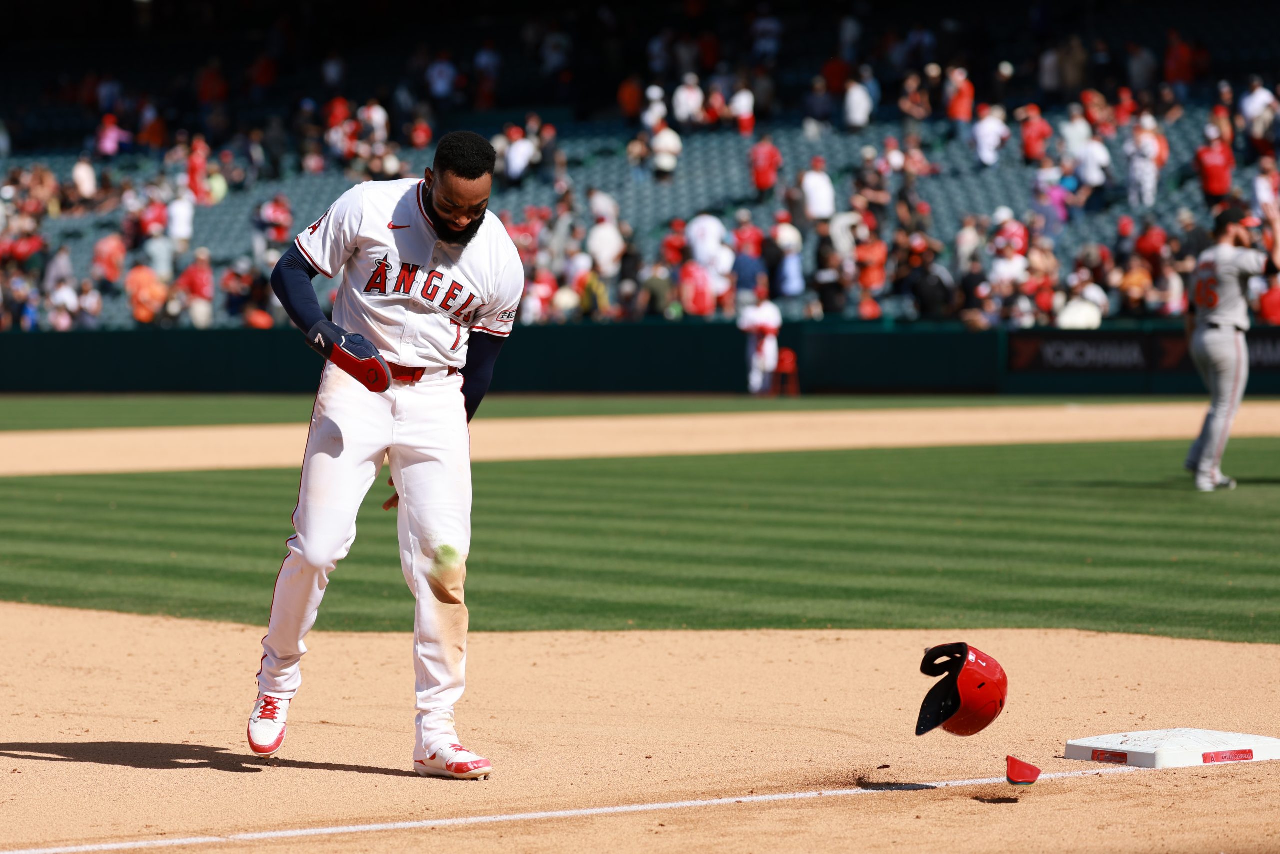
Cubs top prospect Pete Crow-Armstrong blasts first career home run
Pete Crow-Armstrong, the Chicago Cubs' top prospect, hit his first career home run at an opportune time on Thursday afternoon.
Rams planning shocking NFL Draft move
Ahead of Thursday's first round of the NFL Draft, the Los Angeles Rams are reportedly rummaging to trade into the Top 10.

MLB world raving over epic grand slam
Cleveland Guardians superstar Jose Ramirez grabbed everybody’s attention Thursday afternoon. The slugging infielder mashed a grand slam that...
2024 NFL Mock Draft: Final predictions for all 32 first-round picks
MLB world reacts to game-ending blown umpire call
"What's the point of replay system if you get it wrong?"

PK Subban makes admission about Connor McDavid
Does a superstar athlete need a championship to be considered an all-time great? It’s a debate that rages...
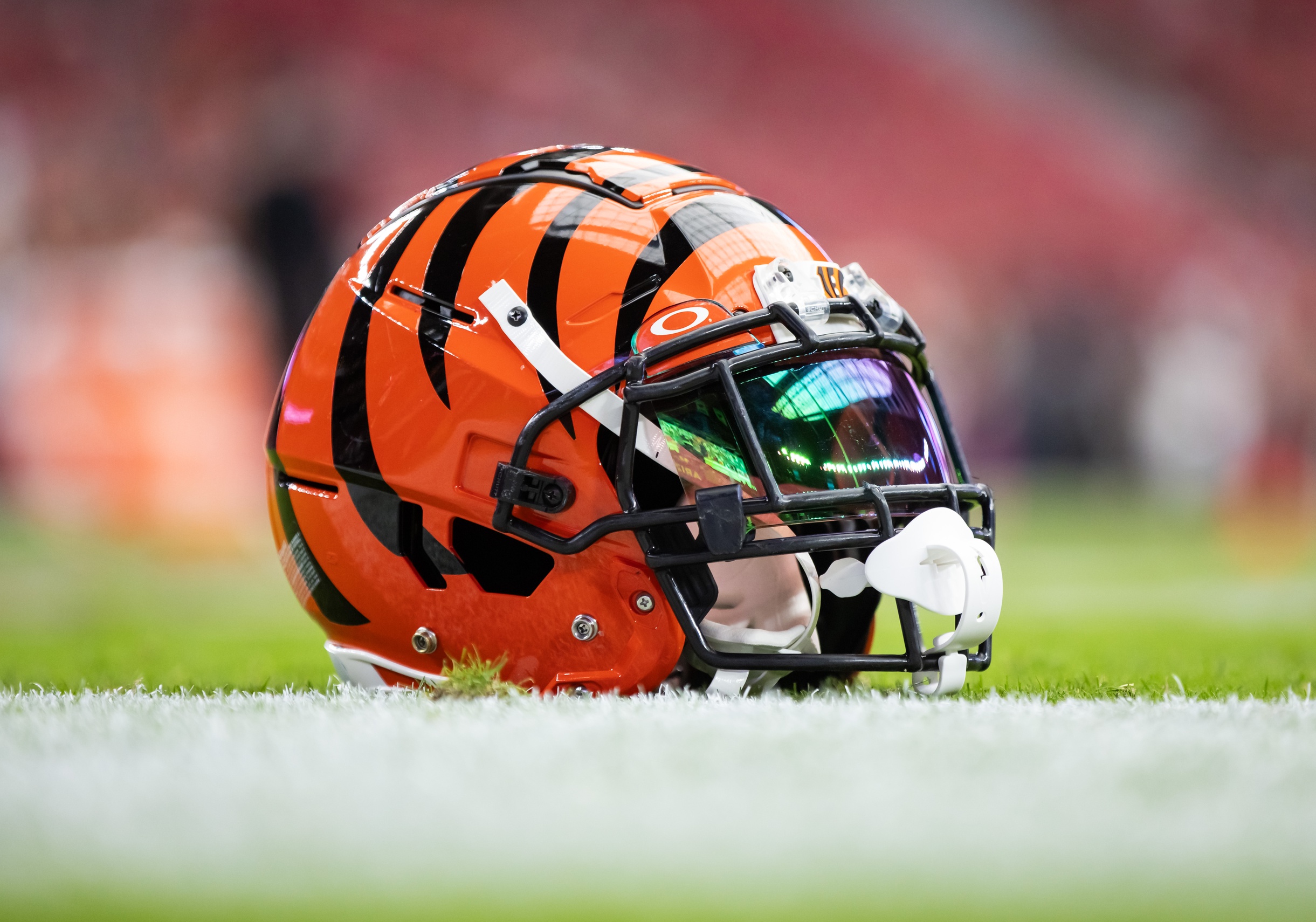
NFL world reacts to Bengals star’s trade demand
The Cincinnati Bengals and wide receiver Tee Higgins haven't made a move in contract negotiations in a year.